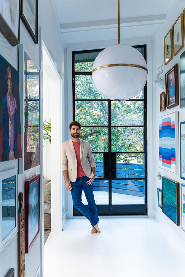
Iain Denholm: Brian, you have such a creative eye. When did you decide that interior design was your calling?
Brian Patrick Flynn: I guess it started while I was in college. I was studying to become a film director, and I was really broke. So, to make money, I started picking up old pieces of furniture to strip and refinish. Then I’d host garage sales, and I’d make more money in one day than I would in a whole month of working. But I never thought I’d turn it into a career. It was just something I really liked doing. About six years later, I was working behind the scenes on television and some of the network executives began noticing that I was really good with the set decorating and began hiring me on weekends to do their homes. Then, unexpectedly, two years later, all of these little design projects that had just been fun to me got published in a magazine, and I began to realize that maybe I could actually make this into a real career. But it was never a part of the plan. The opportunities really came to me, and I ran with it.
ID: Do you feel that not having a formal education in interior design has given you a freer approach?
BPF: Yes, I think that not having had a traditional background in interior design is what’s made me successful and is what sets me apart. I don’t do things the way everybody else does, and I don’t necessarily only use super high-end things. I like to mix an antique with something custom and with something remarkably affordable. When people are self-taught at whatever they do, they end up doing it differently and standing out from the crowd in a good way.
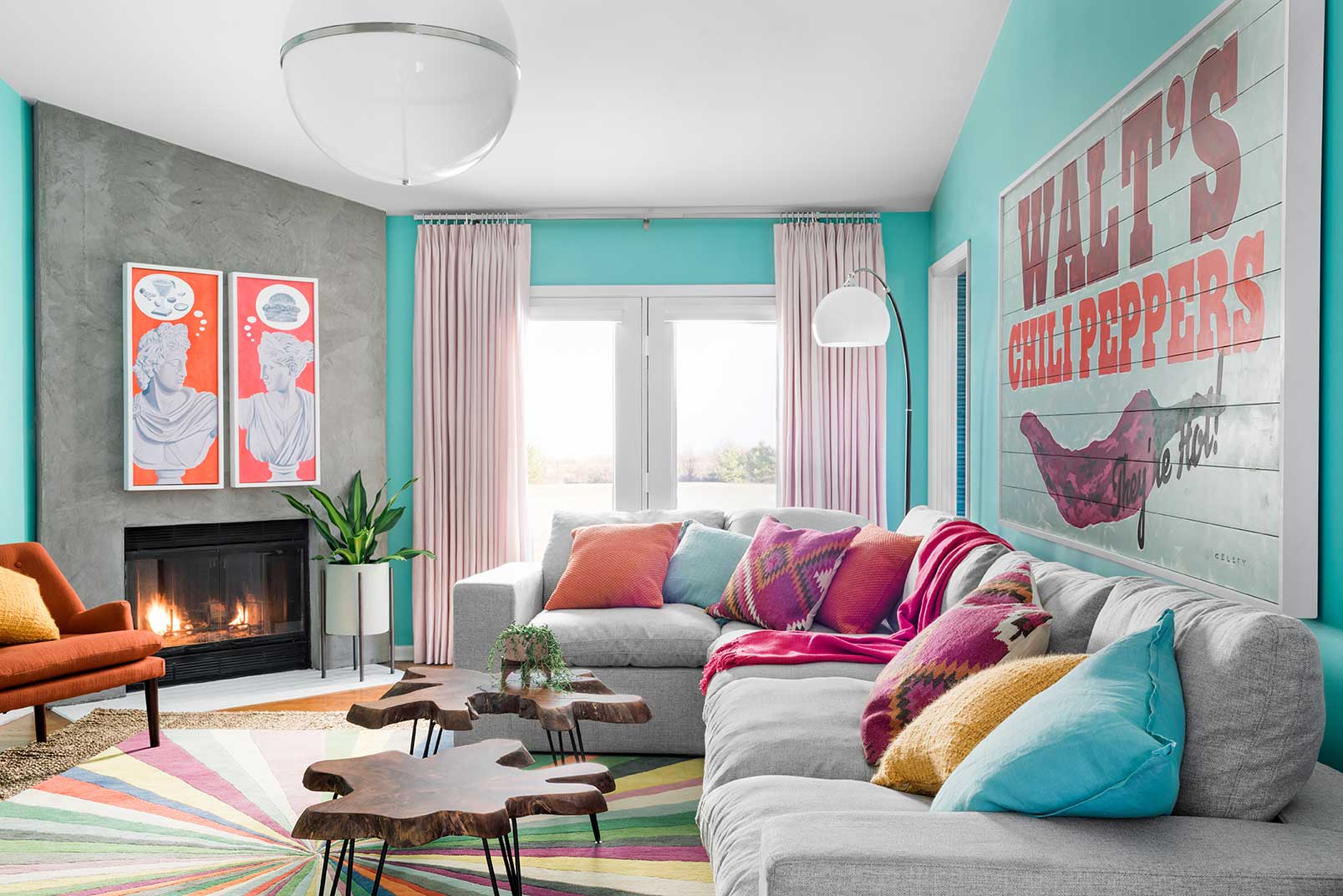
CHILI’S MY HOUSE
A pastel living room designed by Brian was in partnership with Chili’s for a project called Chili’s My House. The Texas-based brand hired Flynn and his team to merge the fun, care-free vibe of the iconic restaurant with his bold, colorful, 1960s-inspired aesthetic.
Photography by Robert Peterson/Rustic White
ID: How would you describe your design aesthetic?
BPF: I see it as ‘soft masculine’. There’s definitely a lot of bachelor vibes, but it’s also super soft and warm and a little more on the gender-neutral side. There are touches of rusticity and ruggedness, but then there are also really soft curvatures and lines and really high-end, soft fabrics that are maybe more on the feminine side. That blend of strong architecture and softness, mixed with some rugged elements, is what really defines my personal style.
ID: In an area of the South where Coastal Chic has been the default décor for the last five years, your use of color is incredibly refreshing.
BPF: Thank you. When it comes to coastal homes, there are definitely a lot of clichés that people immediately go towards. They use a lot of beige and sky blue or colors that make them think of the beach. But in interior design, you are supposed to abstract things. When I’m doing a coastal home, instead of doing the same color scheme again and again, I like to keep everything white and navy, then layer in unexpected colors that you probably wouldn’t pair. For example, sea green or a muted shade of pink—colors that could possibly be tropical but don’t scream Florida billboard.
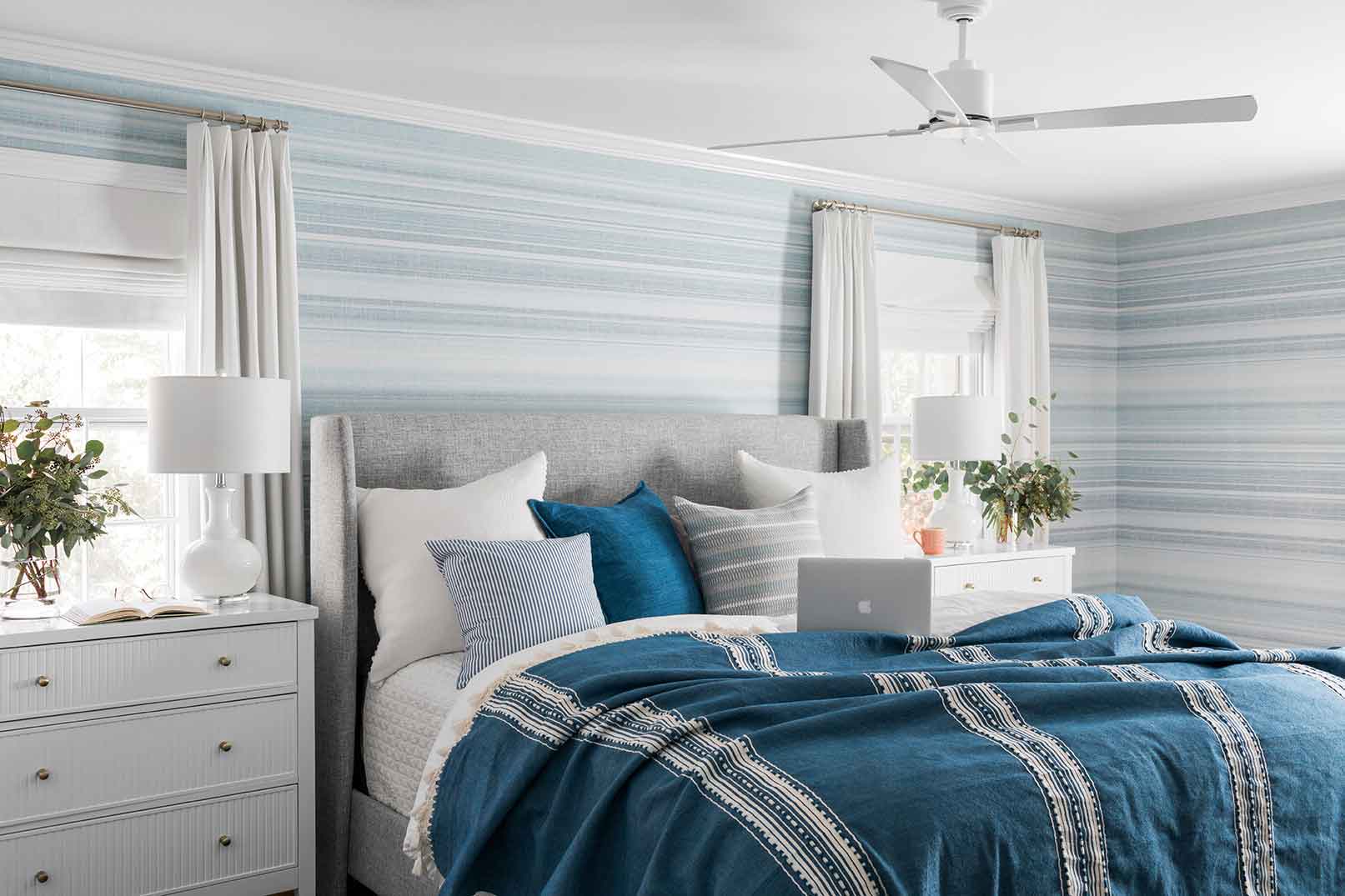
MASCULINE HUES
Of all colors in the spectrum, Flynn uses muted blue-greys more than any other. In this master bedroom, he brought pattern and texture to the walls with an ombre stripe wallcovering from Thibaut.
Photography by Robert Peterson/Rustic White
ID: Do those bright color palettes come from the client or from yourself?
BPF: I definitely have a go-to palette that always seems to work, regardless of who the client is or the architecture. It tends to be a combination of black and white with brown and really deep shades of navy or forest green. Those are colors that are always in style, regardless of what the application is. But the color palette I use the most with my clients, regardless of gender or taste, is faded blue grey, blush and really muted pinks—and that’s for women and men. Those colors seem to always hit the nail on the head, and people don’t seem to tire of them. A lot of men have really embraced blush and millennial pink because it’s warm, it’s fresh, it’s young, it’s happy and it’s not a super trend. People have been using muted shades of pink forever. It’s just enough color to add warmth and personality, but it works with almost every other color and accent.
ID: Have you ever revisited a home you have designed long after the project was completed to see how it has evolved?
BPF: Yeah, it’s actually one of my favorite things to do, and it’s also one of my least favorite things to do at the same time (laughs). I try to choose furnishings, art, light fixtures, rugs and accessories that can be interchangeable throughout the house, so it’s fun to go back and see if all my choices have stood the test of time and how they’ve been mixed up. If it looks good then, that makes me really happy. However, there have been times I have gone back to a house that I’ve made absolutely perfect, and, months later, the person then went on a spending craze and bought more stuff that didn’t fit the architecture and made the space way too cramped, overpowering all of the other things that we had balanced. That makes my skin crawl, and I can’t keep quiet about it. Just like with art or music, if you move one thing or take one element out, it changes everything, so I try to coach people on what to not take out of a room. That’s just as important as what you put in.
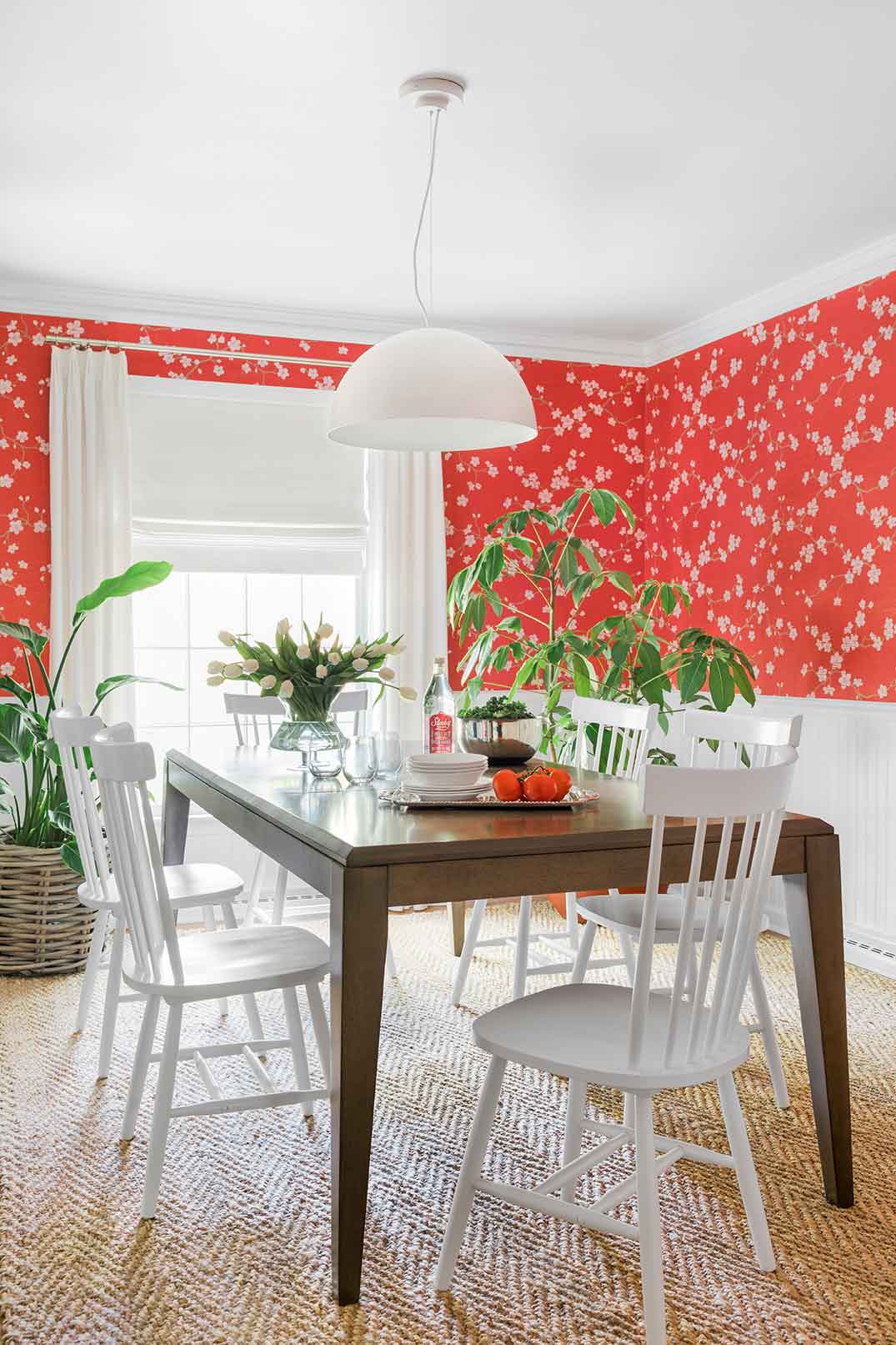
CHERRY BLOSSOM DINING ROOM
A fun and flirty traditional dining room is given a fresh touch with cheerful cherry blossom wallpaper, classic furnishings and a rich textural jute rug.
Photography by Robert Peterson/Rustic White
ID: Do you have a favorite space to design in a house?
BPF: My all-time favorite room to design is the dining room, because people don’t seem to change them up, and they are not used that often, so they always look really polished. I think that’s what makes me happy. Also, dining rooms make me think of the old days where people sat down and talked and exchanged ideas. I like spending time in the dining room because that’s where the best ideas come to life.
ID: You recently finished the 2020 HGTV Dream Home in Windmill Harbour. Of the HGTV homes that you have been the designer on, do you have a favorite?
BPF: I have two HGTV series that I’m the interior designer on: HGTV Urban Oasis, where I renovate a house that’s in a very pedestrian, up-and-coming city, and HGTV Dream Home, which is a house that’s built from the ground up on a dreamy piece of property that instantly makes you think of vacation. My favorite HGTV Urban Oasis home was in Minneapolis in 2019. It has a special place in my heart because it was the first house that’s been my own personal style. It’s all black and white, super low slung, mid-century modern, almost industrial and very Scandinavian. My favorite HGTV Dream Home is a tie between Hilton Head Island and Whitefish Montana. Both are big houses situated on absolutely jaw-droppingly beautiful pieces of property, but they offer completely different types of lifestyles. On Hilton Head Island, you can enjoy the sun during the day, and at night it’s still warm enough to sit around an outdoor fire pit, whereas Montana is totally different. In the winter, there could be 15 feet of snow, and you can’t leave your house, and you have caribou and deer all around you. So, I love them both, but in different ways.
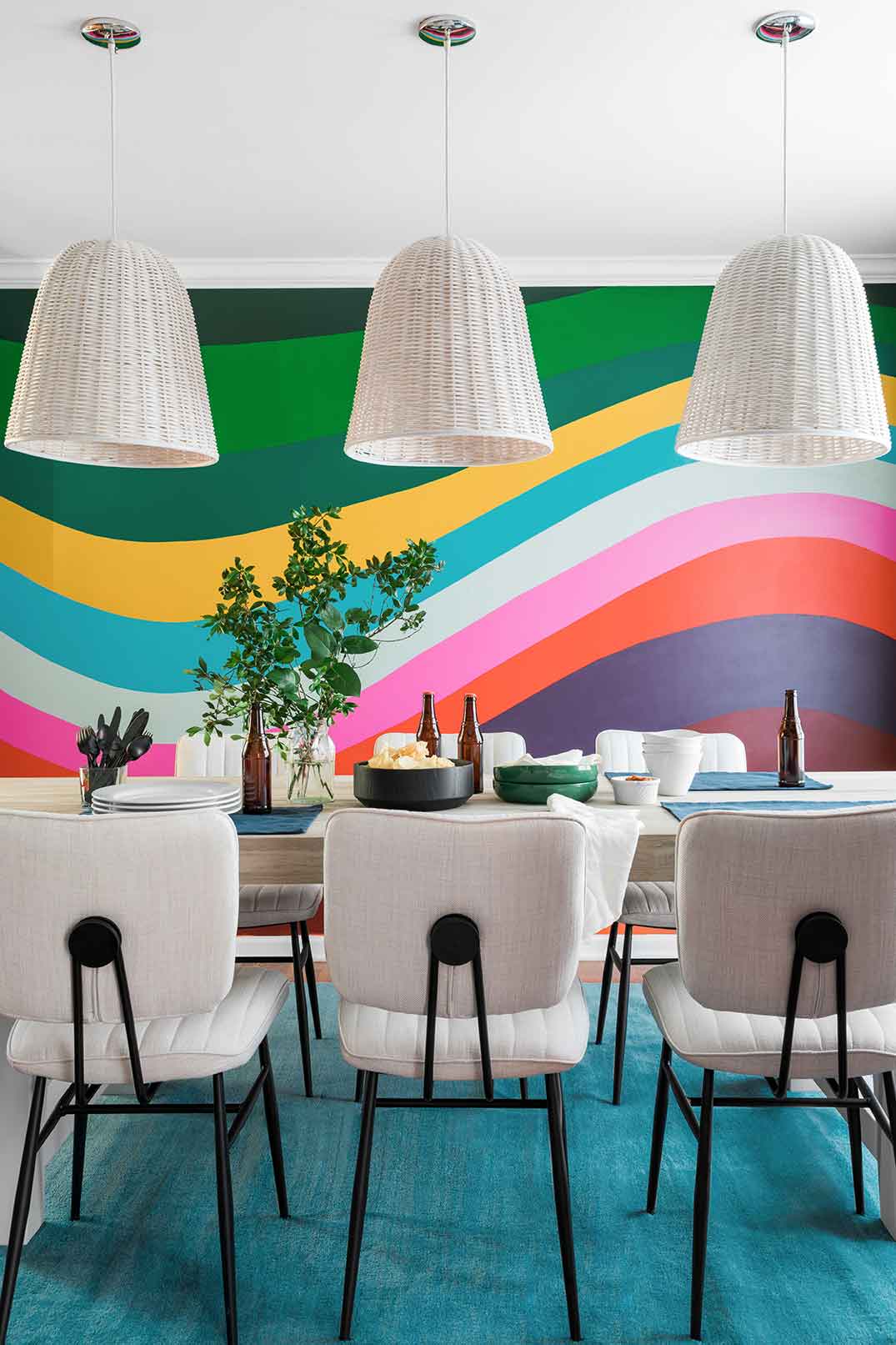
Admittedly one of his all-time favorite projects, this dining room was designed in partnership with Chili’s. Brian surprised Chili’s self-appointed biggest fan with a dining room inspired by the fresh, fun look of the iconic restaurant.
Photography by Robert Peterson/Rustic White in partnership with Chili’s
ID: What other shows on HGTV do you love?
BPF: I watched the HGTV series House Hunters International religiously, so it was fun to actually be on that show. I bought my summer home in Reykjavik, Iceland through it too, so that’s definitely my favorite HGTV show.
ID: You mentioned Scandinavia in relation of your personal style. Tell me more.
BPF: The Scandinavian aesthetic entered my world when I bought my home in Iceland, and I fell in love. I was inspired by the simplicity, the laid-back warmth and the whole Hygge style of Scandinavia, and it made me rethink how I’d been living in my own home. I immediately started to get rid of stuff, and now I ensure that whatever I buy is super comfortable and is something I’ll use. I definitely now have that Scandinavian mentality of only buying things I truly need and which make me happy.
ID: Your Instagram stories are fun and give a great insight into your life and your work. What do you hope your followers get from your Instagram feed?
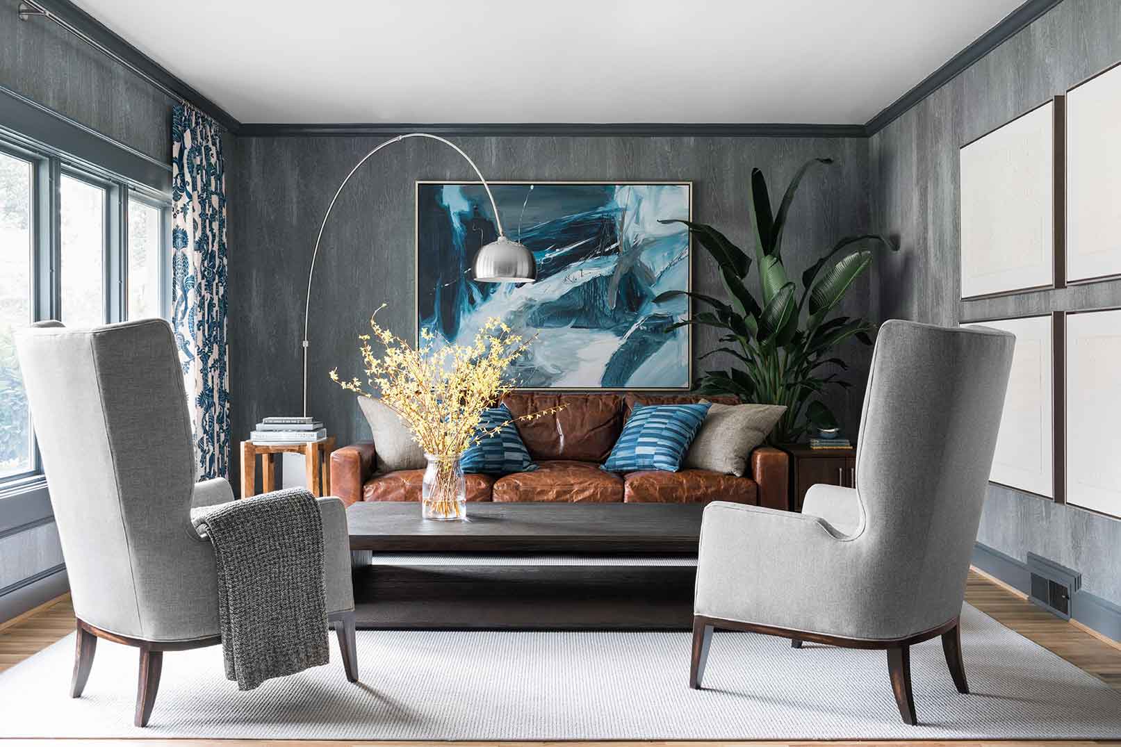
Believe it or not, this den is both kid- and pet-friendly. Brian designed this for a young family with two large dogs. The walls are covered in a faux bois vinyl that’s totally washable. Flynn chose an indoor-outdoor area rug that stands up to muddy paws and sticky fingers. An aged leather sofa is equal parts comfortable and effortlessly chic.
Photography by Robert Peterson/Rustic White
BPF: My Instagram is far from perfect, and I think that’s what makes it fun. What’s interesting is, we interior designers have a job where we’re making houses look perfect, and if you go through any interior designer’s Instagram feed, you’ll see hundreds of beautiful, perfect pictures of gorgeous homes. But what comes with that is a seriousness, and that’s what I don’t like. When people view my Instagram and they actually see my life, they realize that interior design is not perfect. I love to use my stories to show all the trials and tribulations of things that go wrong and how to fix them and also how to embrace the imperfection. I think that by pulling back the curtain and showing imperfection, I’m shedding a new light on an industry that’s really all about perfectionism, and I kind of like being the underdog and showing when I mess up. People really relate to that.
ID: You were recently married in Antarctica, which doesn’t seem like a typical place for a destination wedding.
BPF: No (laughs). I’m not a big wedding person, so I never really wanted to have a big wedding. But I wanted an experience that would be totally out of this world. It took two years of planning a lot of logistics to get there, but it was so special. I was born and raised in Florida and spent 27 years of my life in a tropical environment with humidity and bugs, so there is something about a polar environment that’s so pristine and beautiful and mysterious to me. I find it super romantic. I also love the silence you find in Antarctica. Working in interior design, I show up to a job site and there are 50 to 100 people there. It’s total chaos. So, when I’m not working, I want the complete opposite. To me, a place that is pristine with very few people and no noise is paradise.
ID: When it came to designing your home together, do you guys have a similar style, or did you have to compromise?
BPF: So, the thing that sucks for Hollis, who is my significant other, is that I’m a bit of a bulldog when it comes to interior design. I wanna do it my way (laughs). Luckily, he works in fashion; he’s a costume designer for movies and TV shows, so the way we have worked it out is that, when it comes to clothes and our closet and organizing, he has 100 percent creative control because I’m not good at it. The great thing is, we’re both really all about comfort, so we tend to like anything that’s super comfortable and laid back. That’s good news because we’ll both look at the same sofa, and if it makes us wanna cuddle up in it, then we know we both love it.
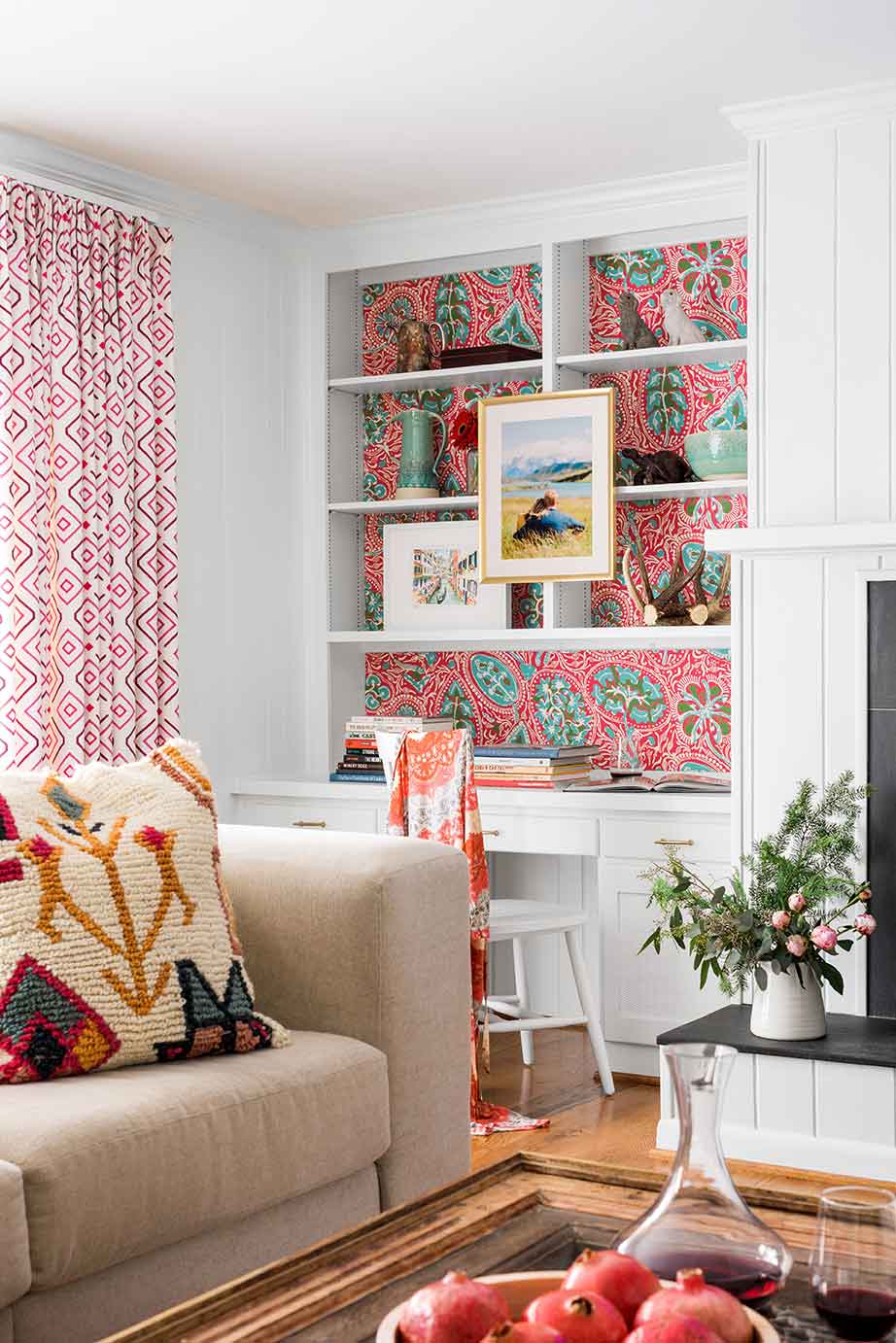
Brian revamped what was a dated living room by painting its paneled walls glossy white, then adding luan behind its shelves to install a fun wallpaper in shades of pink and aqua.
Photography by Robert Peterson/Rustic White
ID: When traveling for work and staying in hotels, are there any items you take with you to give a feeling of home?
BPF: Apart from my Bluetooth speaker, because I constantly have music on, I always travel with a picture that a friend’s kid drew for me. It’s a picture of a bear and a giraffe and it says, “I love you.” It’s totally messy and crazy, and it’s the sweetest little thing. Having that little piece of art made by a kid almost makes me feel like a kid again myself. Every time I go somewhere, I have it in my backpack, and when I set myself up in an Airbnb, I take it out and it makes me happy.
ID: What advice would you give aspiring designers on how to break into the interior design industry?
BPF: My tip would be to always hire a professional interior photographer to capture your work, because it’s very hard to capture a room the way you see it in your mind through a lens. Interior photographers aren’t cheap, but they understand interior design and light. One of the biggest mistakes young designers make when they start out is, they just take a few pictures with their phone and put them on their Instagram. However, they’ve spent months, or years, trying to complete a project, so to not spend a few thousand dollars to have it immortalized is doing themselves a huge disservice. When I started out, I tried to take pictures of my rooms myself, and no magazine wanted anything to do with me. So, for the first two years of my career, all the money I made, I put back into hiring a professional photographer. That way I knew I would have a really strong portfolio and people would take me seriously. Also, I would say, never compare your work to other people’s. With social media, people are too quick to do that, and they make themselves feel bad. However, in the world of interior design, there is enough work for everyone, and somebody who is gonna hire a designer who does all neutrals is not gonna hire the designer who does hot pink walls. So, comparing is ridiculous. It’s apples to oranges!
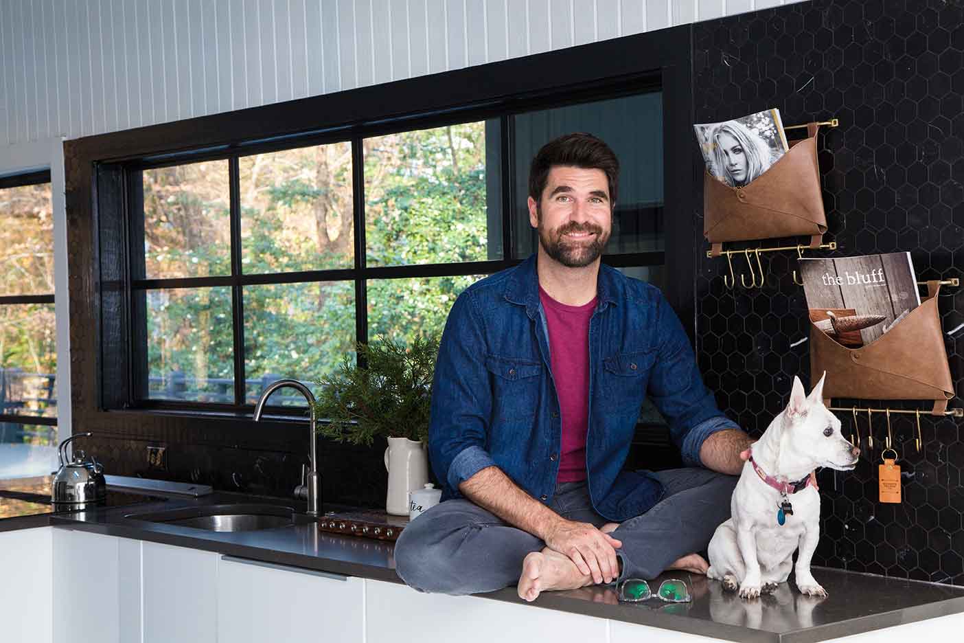
The designer at home in his industrial-modern kitchen. To bring the 1965 mid-century modern ranch into 2020, he added custom steel windows and doors throughout.
Photography by Robert Peterson/Rustic White
ID: In our social media driven world, where everyone seems to have an opinion, how do you maintain your own confidence?
BPF: I never read comments, I never leave negative comments, and I don’t really look to see what other people are doing. I post my own work then I leave it and move on. I grew up in the ’90s, so I didn’t have a cell phone until I was in college. But all these kids who grew up in the early 2000s, who had Facebook when they were still in middle school, have this burden of having a real life and an internet life. Luckily, to us Gen Xers, the internet was just an extra thing you got to do for fun, and I don’t know how I’d have navigated that. My feelings don’t get hurt when people bash me on the internet because, to me, the internet is an imaginary place. But if you are six and all your other friends have Instagram, then that’s a whole different world.
ID: Finally, you work incredibly hard. What so you do to truly relax?
BPF: The most relaxed I’ve felt in a long time was when I was alone in Iceland. I went out to dinner by myself for two or three nights in a row, and I took a book with me. By the time I finished that book, I felt like a brand-new person. Nowadays, everything feels so instant, with our iPhones and social media, and people don’t really read books like they used to. But there is something to be said about the art of reading. It really replenishes you. Another thing that really relaxes me and that I find remarkably fulfilling is writing, and I’m currently working on my first design book. I’m not really good at sitting still and doing nothing, but I’m working hard, doing something that makes me really happy, and I’m getting paid for it. It doesn’t even seem real!

