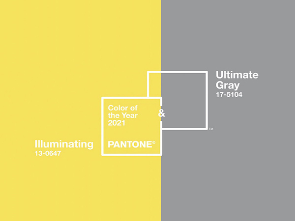
Pantone, the global color authority and provider of professional color language standards and digital solutions for the design community, has named “Ultimate Gray” and the lemony yellow “Illuminating” as the duo Colors of the Year for 2021. In a year when most of us are seeking ways to fortify our energy, gain greater clarity, and maintain shreds of hope amid continued uncertainty about the future, these two hues combine deeper feelings of thoughtfulness with the optimism of a sunshiny day.
The bright and cheerful Illuminating sparkles with vivacity and a warmth suggesting the power of the sun, while Ultimate Gray embodies solid, foundational, and dependable shades we find in natural elements, highlighting an ability to stand the test of time. Ultimate Gray silently assures, encouraging composure, stability, and resilience.
“The union of an enduring Ultimate Gray with the vibrant yellow Illuminating expresses a message of positivity supported by fortitude,” said Leatrice Eiseman, executive director of the Pantone Color Institute. “Practical and rock solid but at the same time warming and optimistic, this is a color combination that gives us resilience and hope. We need to feel encouraged and uplifted; this is essential to the human spirit.”
Together, the colors say, “Let’s start fresh,” and according to Pantone, they do not have to be used in equal proportions. Either color can take precedence. In home décor, Ultimate Gray and Illuminating make a great combination to set the mood in any room, adding a dose of sunshine and positivity. Here are a few ideas to consider when updating your interiors:
- Add color with small updates. Since color trends are … well, trendy, a great way to incorporate them is with accessories that you can easily and inexpensively swap out. Think area rugs, pillows, throws, and art when you want to try out the Colors of the Year without going all out on furniture purchases or painting walls. Just begin with a few small updates to see how you are going to vibe with the colors in your space. If you still love it after a while, then consider a larger dose of one or both colors.
- Take it outside. Use Pantone’s 2021 colors outside to create an inviting patio, porch, or deck. Select neutral foundational gray patio furniture, then accessorize with bright accents, such as yellow pillows and even in the landscape with yellow flowers. Another idea is to find some cool, shiny yellow garden stools that can either be used for extra seating or for side tables. Get a nice gray outdoor area rug to ground your outdoor area and upgrade any arrangement.
- Keep it in the kitchen. Ultimate Gray is a classic, timeless neutral that would make a great color choice for kitchen cabinets or a center island. Such a versatile color can be used with many other hues, so switching things up when your tastes change is easy. Incorporate Illuminating into your color scheme with sunny chairs or barstools or roll out a runner with a bright yellow pattern.
- Modernize the bathroom. Update and modernize your bathroom with these Pantone colors of the year. Ultimate Gray makes a gorgeous bathroom wall color or consider using it on the backsplash or floor tile. Then add in pops of yellow in hand towels, rugs, and counter accessories.
- Layer fabrics. Gray and yellow textiles will add a whole other layer of comfort to any room. Both tones create an inviting feeling that’s especially cozy in bedrooms and living spaces. For example, drape a quilted throw at the end of your bed, pile your sofa with plush pillows, or hang gray and yellow curtains to dress windows. These versatile hues work well with most neutral color schemes as well as colors like blue and green.
- Brighten up the front door. A bright, happy yellow front door will set a welcoming tone on any street. The color will contrast beautifully against exteriors with gray siding or roofing materials. Consider outlining the door with white trim to emphasize the contrast.
- Create a calm bedroom. Gray makes a relaxing addition to bedrooms as it is such a soothing color. Think about applying the soft neutral on large surface areas, such as walls or bedding, as a calming backdrop. Then mix in a yellow patterned area rug or throw blanket for a pop of energy that will help you wake up happy each morning. Metallic or mirrored accents are also cool ways to incorporate a variation on the gray that will bring some shine and dimension to any bedroom.
- Accessorize anywhere. Use Illuminating with Ultimate Gray side by side in table linens, sheeting and home accessories, including pillows and tabletop, to infuse your spaces with vitality and balance. Display yellow dishware on open shelves, a bowl of lemons on the counter, or a touch of yellow on a patterned Roman shade. In the office—whether in the home or in a commercial space—allow Ultimate Gray to provide the firm foundation for Illuminating, a vibrant color that heightens awareness and enhances intuition. Hang yellow drapes in a sunroom. Accent a wood table with yellow chairs and gray tiles in the background. Paint the back of a china hutch yellow. Put yellow and gray wallpaper in a laundry room by painting the underbelly of the sink yellow and the trim gray to brighten the laundry chore.
“The Pantone Color of the Year reflects what is taking place in our global culture, expressing what people are looking for that color can hope to answer,” said Laurie Pressman, vice president of the Pantone Color Institute. “As society continues to recognize color as a critical form of communication, and a way to symbolize thoughts and ideas, many designers and brands are embracing the language of color to engage and connect.”
The ideas are endless. Whatever you decide, just get in on the fun. These contrasting colors represent the thoughtfulness and resiliency we’ve found within ourselves this past year, as well as a renewed sense of optimism and enthusiasm for what lies ahead in the coming year. They’re sure to become one of the biggest color trends of 2021.


